
When I was a kid, the family kitchen table was an inexpensive round wooden table that my father covered with a world map and varnished. I usually sat at Africa, musing over the location of the Kimberly diamond mine, carefully adjusting my glass to ensure it wasn’t covered. My parents enjoyed talking about current events, history, and their own family stories over supper. I remember tracing the line of travel from Sicily to New York as my mother talked about her grandparent’s emigration just seven days after they married; moving the salt and pepper to get a better look at Iran during the hostage crisis; realizing that the Soviet Union’s missiles were far closer than a flat map suggested as my father explained great circle routes. On the road, AAA’s triptiks were the guide to safe and swift movement from Point A to Point B. (Point C was typically allowed only if it had some educational merit and didn’t cost a lot of money. We have some great pictures of the back of the Statue of Liberty from a distance, because it turns out that Liberty is not Free — or even cheap.)
I realized during this assignment that I don’t particularly like looking at maps for their own sake, and that leads me to admit upfront that my assessment of any atlas will be biased in favor of those that best convey data. The class text, Derek Hayes’ Historical Atlas of the United States, was a pushing off point but we were permitted to choose atlases and maps that spoke to us personally. I pulled the Conservation Fund’s Civil War Battlefield Guide off of my own bookshelf, and then went on a digital exploration that ended up at Harvard University’s Digital Atlas of Roman and Medieval Civilizations.
The Printed Atlas
Historical Atlas of the United States is a collection of 535 maps depicting the history of the US from the earliest explorers through September, 2001. The author, Derek Hayes, is a professional geographer who has published a number of atlases for specific regions.
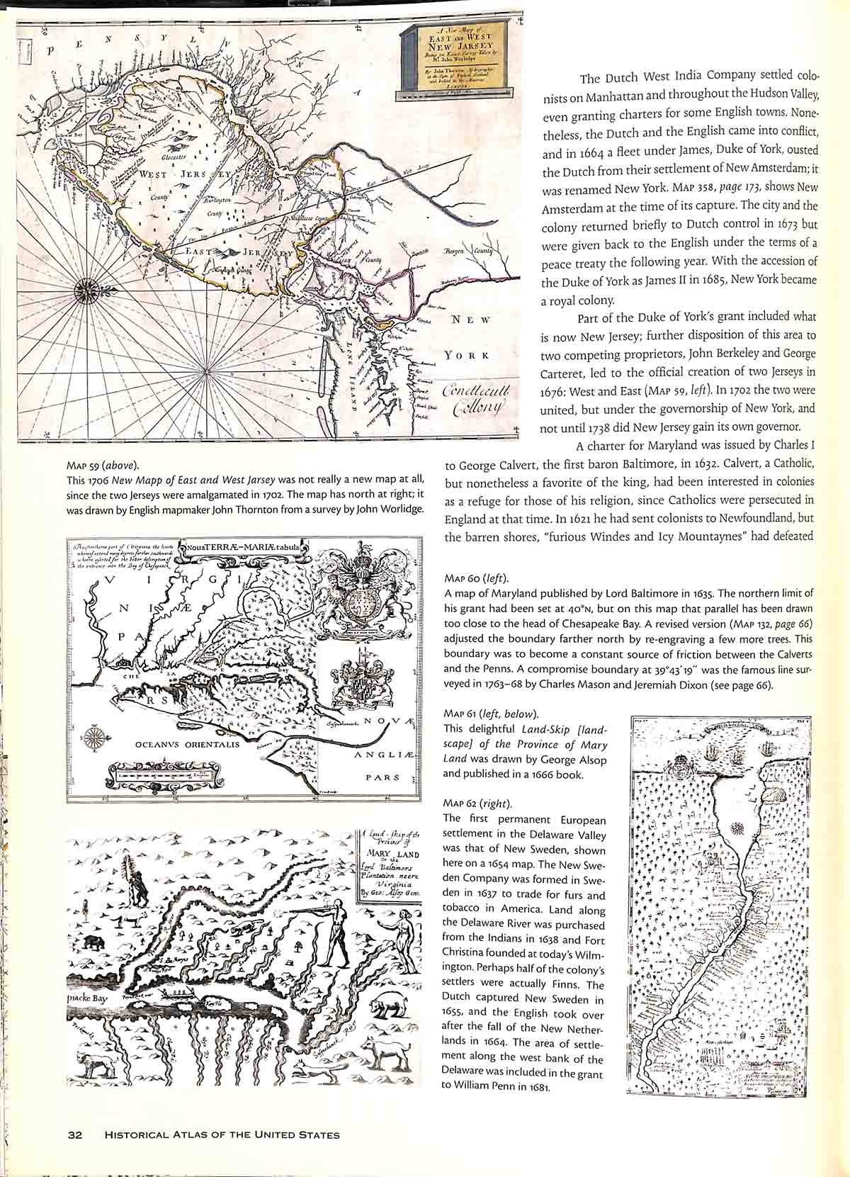
The purpose of this atlas, published in 2007, is to tell a comprehensive history of the US from a geographic perspective. In most ways it is a traditional atlas: chronologically arranged, with text as the narrative and the maps as an illustration of that story. Many of the maps in this collection are available online at the Library of Congress or other public portals. The bibliography lists sources for each map, but not the specific permanent link for online access.
The Historical Atlas demonstrates the limitations of a popular history atlas: the map images typically too small to examine closely; often, only a partial view is exposed. It’s a decent coffee table book for the casually interested reader. It is not a reference book – particularly for the near-sighted.
The Civil War Battlefield Guide is more successful as an interpretive guide. The goals of this book are two-fold: to guide visitors through battlefields (many of which have disappeared under a modern landscape) and to assist battlefield preservation efforts. (Guide, p. xxv).
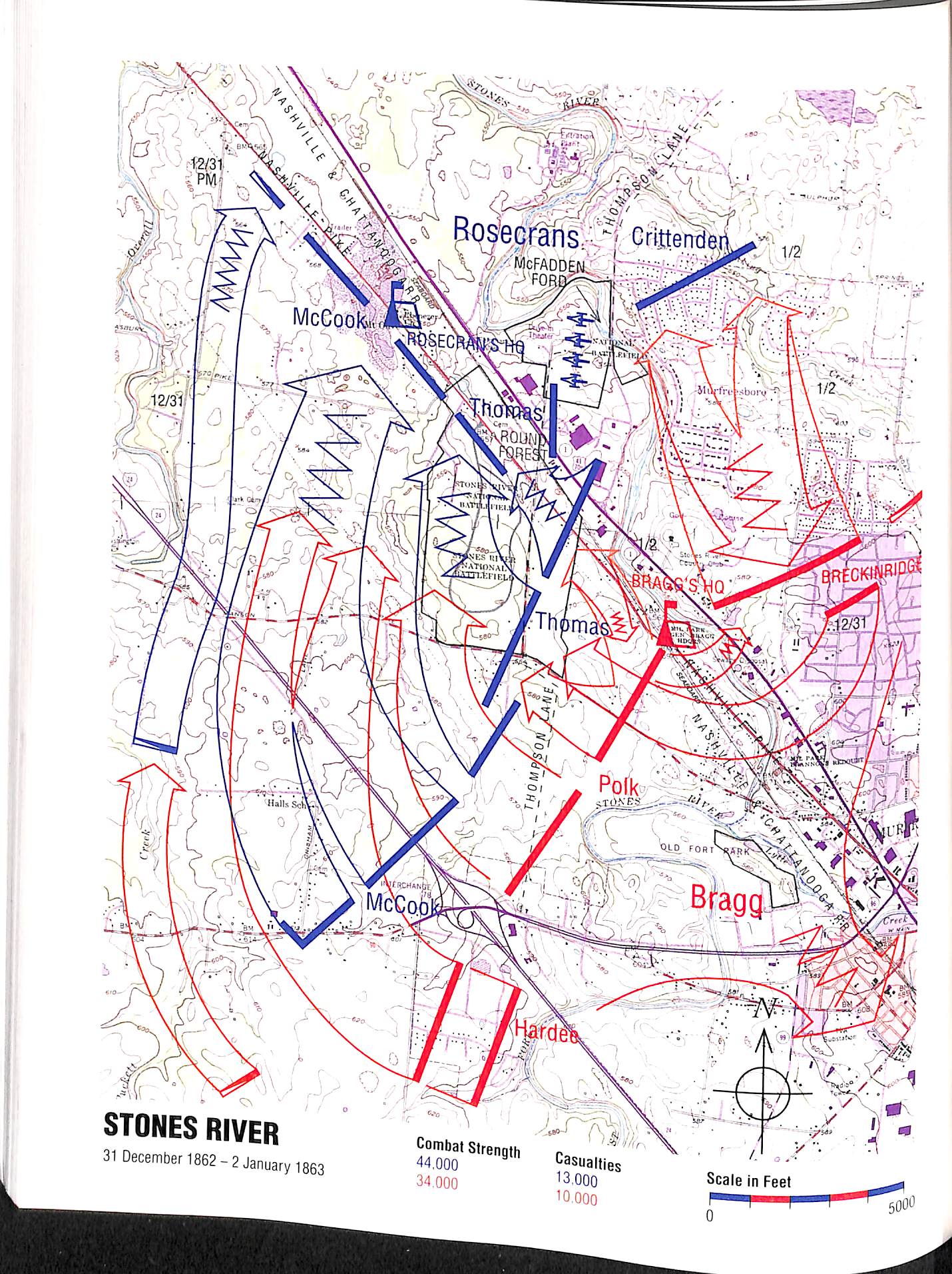
To achieve this, a distinctive map style was adopted, using modern U.S. Geological Survey topographical maps as the base. Signifiers are limited to a few important items (e.g., Red for the Confederacy, Blue for the Union; typeface size denotes hierarchy of commanders, thin lines with arrows depict battle lines and avenues of retreat and advance). Battles are described in chronological order, the maps are used to illustrate significant or complex battles.
A significant advantage of using modern USGS maps for this atlas is that users can orient themselves to the current landscape as they attempt to navigate the battlefields. (Click on the Stones River map for a larger view, which clearly shows roads and other infrastructure.) The notations for buildings and other large structures serve as both warning about private property boundaries and an inducement to consider the merits of the Conservation Foundation’s mission. The topography information is valuable to understanding the rationale for lines of movement and key positions. One drawback to this approach is that the presence and clustering of the local population as it was during the battles is not represented. Similarly, representation of contemporary railroad lines would have aided interpretation of the movement of armies. Overall, for an atlas with a specific purpose and audience, it is very successful.
Each of these atlases illustrates the limitations of the printed map: only so much information can be presented before it becomes an unintelligible collage of symbols and text. The cartographer is forced by necessity to prioritize information that is valuable to a specific audience and purpose. Paper is expensive (even more so in 1500); updates are published (and purchased) only when the changes are significant enough to warrant the cost. Future historians critique these choices (accurately or not, objectively or not) in the context of their own time and ideologies.
What if there were another way?
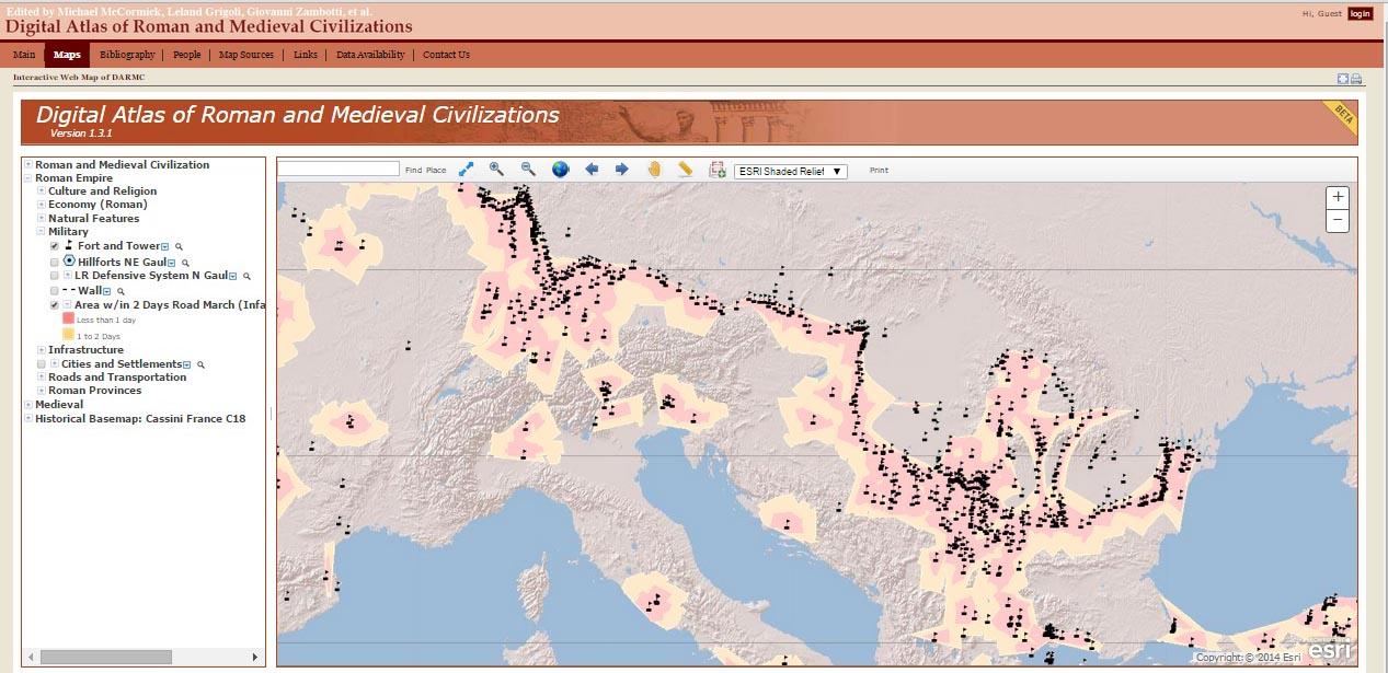
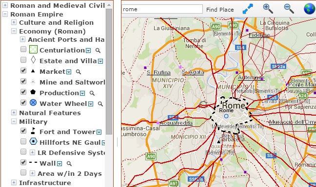
Harvard University’s Digital Atlas of Roman and Medieval Civilization (DARMC) is a collaborative effort to map the Roman Empire and Medieval periods (nearly 1000 years). Content from disparate sources has been disaggregated into individual data and reassembled into georeference datasets that serve up separate layers on the map. The opening map has an unobtrusive relief base and a default display of the layers for forts and towers, with an estimation of 1-2 day travel distances surrounding them. To the left, a column of data choices permits the user to select economic, cultural, military, architectural and landscape features to display.
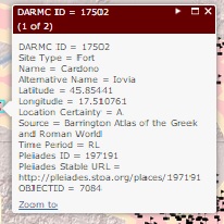 The digital atlas does not present a narrative, relying instead on the data itself to tell various stories. Hovering a mouse over the menu listings brings up the source of the data file, with licensing information. Clicking on an individual icon presents specific information about the source of the that data item, including an assessment of the location reliability.
Base maps can be changed, or users can export data files into Google Earth or their own GIS software. Users are not constrained by propriety software programs.
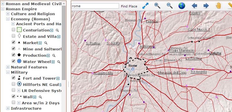
The digital atlas takes historical map analysis a step beyond overlays of original maps. By data mining old maps, texts, and archeological findings, historians have a representation of the current best-effort objective locations of physical data. Corrections can be updated in minutes, rather than waiting for the next edition. It provides an objective standard against which original maps can be compared for content and for the spatial perceptions of their creators. It is an answer to Lefebvre, Harley, et al’s charges that maps are an instrument of power and control by placing that control into the hands of many, while accepting new data from vetted sources. The GIS files are exportable in a multiple common file formats, which gives users with non-accepted sources the power to create their own representations. The data sources are also fully transparent; the site includes a full bibliography, list of map sources, and downloadable datasets for critical review.
Historical maps are an interesting object of study by their own merits,yielding clues to the mindset, biases, and social/political/economic agendas of their creators. For objective competing analysis of the data within those maps, however, the digital atlas will prove indispensable.

[…] review of historical atlases caused several of us to reminisce fondly of past travels with family or friends. But I also […]