
My image assignment is here. I enjoyed working on each of the tasks (well, maybe not the gradient) and believe that I have a decent grasp on the skills necessary to reproduce the work in the future. I particularly enjoyed colorizing and find myself gazing with longing at old photographs; this is much more fun than a coloring book and pencils.
As I worked on my young cavalryman and his horse, I ruminated on the class discussions and blog commentary about the ethics of colorization. I remember when TMC started colorizing films, and the ruckus it created over such issues as the original artistic vision, the quality of the colorization itself, and misleading viewers. I also recall seeing a documentary about the craft of black and white filmmaking, which required creating effects to replace the role that color played — as a result, I often spend some time looking at the lighting and stage design in black and white films.
Today, I don’t think anyone even notices when a colorized film is presented — but I also see that the original black and whites are still being shown often. I expect that the expense of colorization prevents wholesale transformation.
I don’t think my colorization is going to fool anyone, but I’m fairly pleased with it except for the ground. 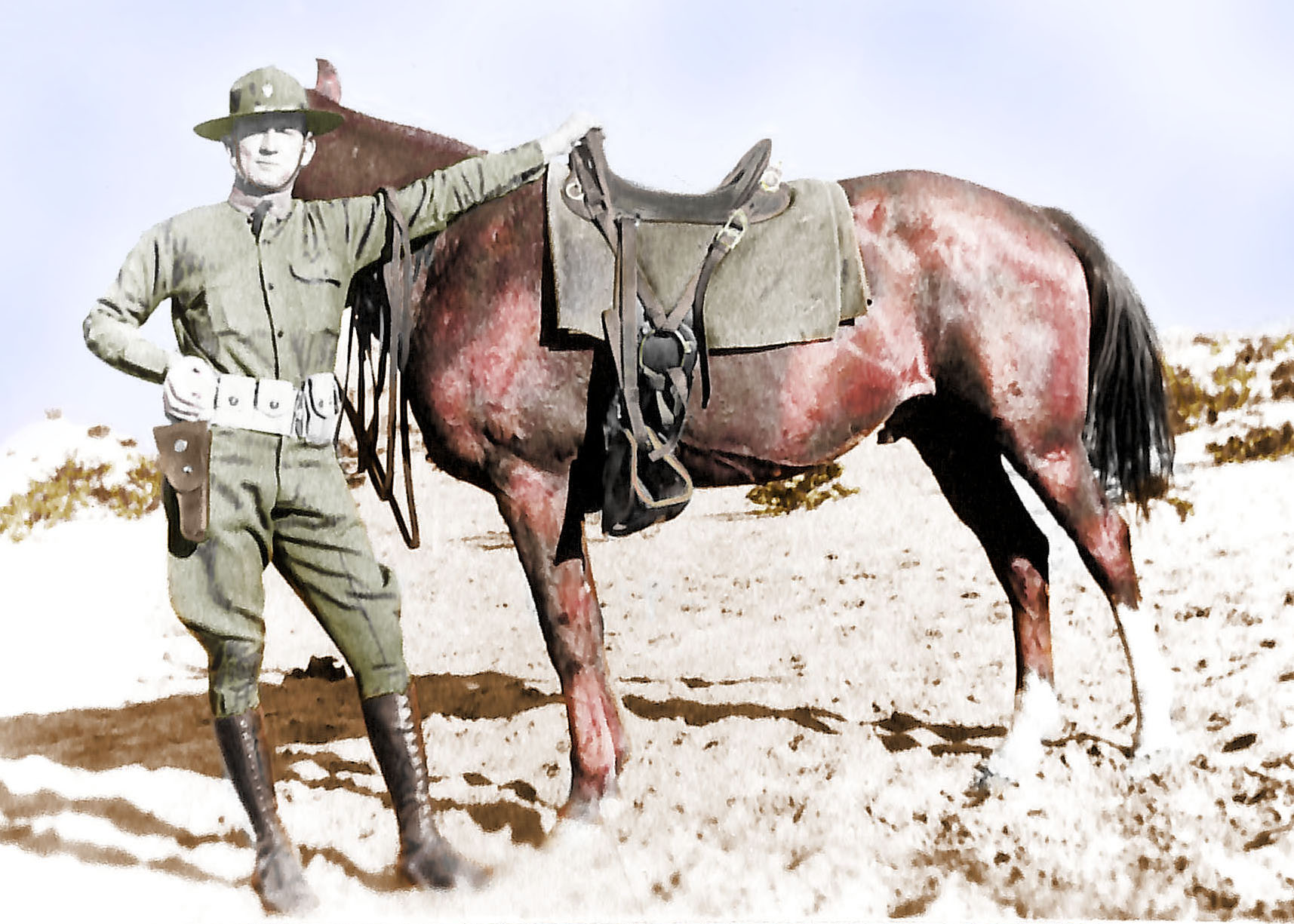
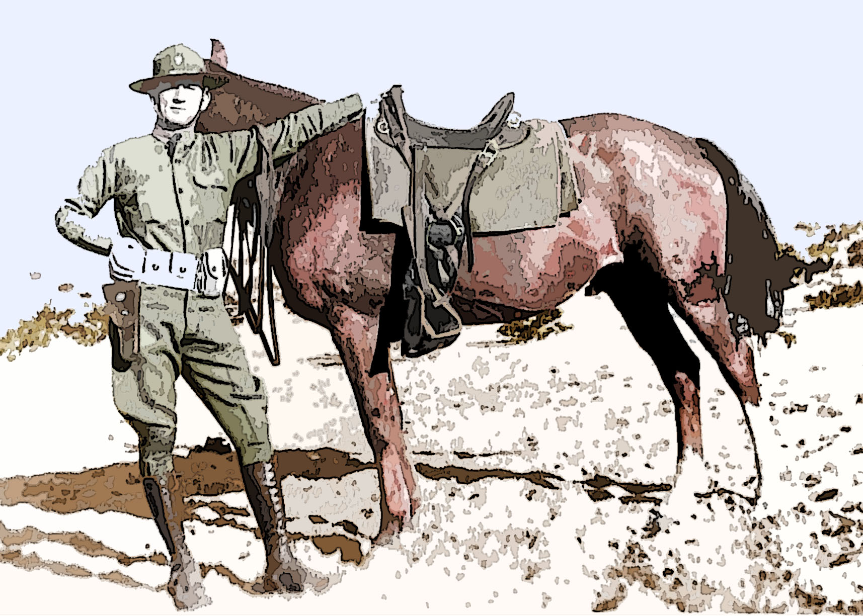
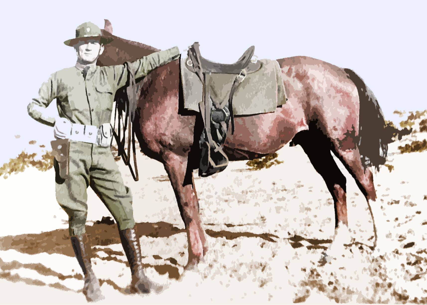
I started wondering if a bit of over-emphasis might help to signal restoration work to the viewer without detracting from the intended use — such as a book cover, magazine article, or gift shop artwork.
You can click on the images to enlarge them. What do you think?
I commented this week on Kater’s, Mark’s, and Rebecca’s blogs.
