
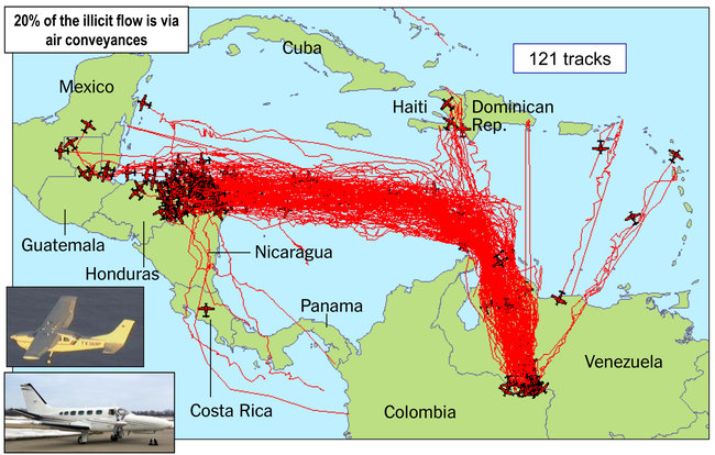
Source: Joint Interagency Task Force South
“We “should put pins on the map and then connect the tracks with string.”
<pause>
“Why would we do that?”
“Because then when visitors come into the space, it will look like we know what we’re doing.”
I don’t recall what, exactly, my response was to the young officer who offered this idea. It was sufficient to send him scampering back to his desk, never to raise the issue of style over substance again. He was a reservist with a background in marketing. I was active duty, with a need to process enormous amounts of data in a very short time-frame. We were oil and water. I was his supervisor; water won.
Yes, I realize I just dated myself with this little story. Today, junior officers spend hours generating slides to depicting tracks (and everything else) for senior officers to look at. We call them Powerpoint Rangers. The reservist was ahead of his time. (A note about that slide. Regular people would call smuggling aircraft “aircraft.” The federal government calls them “air conveyances” in order to account for the possibility that smugglers may, at some point, begin using blimps, rocket ships, or helium balloons to deliver drugs in addition to “aircraft.” I was in the vicinity when this term evolved into use and it still annoys.)
My bias remains in favor of defining form by the content and function of the site. The readings we’ve been working with over the past couple of weeks seem to agree that the early emphasis should be on choice of type and colors that are easy on the human eye and an arrangement of content that is functional for the user. Aesthetically, the design should be pleasing, in accordance with the subject of the site, and contribute toward the site’s credibility with the user.
I’m not an aesthetically sensitive person, and very little in my professional experience has ever encouraged me to improve upon that — until now. I’m fairly confident I’ll handle the technical skills well; my struggle will be with design choices. Discussions about how type makes the viewer “feel” already make me uncomfortable. I’m better with color, but there’s a reason I specialize in restoration of quilts rather than making my own originals. I know that several of my classmates are art history majors and I’ll be interested to hear how they react to the discussion of color and typography, and to see what results in their classwork.
My portfolio page is mechanically and artistically the minimum that the assignment required (white space is my friend). It took three days to put this masterpiece together and the process served to underscore the decision I made several years ago to stick with WordPress as my website platform, using Weaver as my go-to theme. Weaver is a highly customizable theme; the genius is in the admin panel that translates all of those myriad design details into plain, well-ordered plain language choices. It’s nearly impossible to break and the design process is swift. For my personal site, I chose to make it even simpler and deliberately restricted myself to WordPress-hosted options.
At any rate, it’s a stinker of a page, and I certainly don’t look like I know what I’m doing. I’ll comfort myself with the idea that it will help to serve as a dramatic “before” picture to contrast with my final project.
This week’s readings on typography were interesting and a helpful guide to considering the fonts I want to use on my final project. As the portfolio page hints, the subject of my project is a study of the JA Ranch hands and their families during the early 1900’s. I don’t want to use a stereotypical font (which also strikes me as unserious), but I would like to find something evocative of the era and the culture. The concepts presented in the class texts provide some useful guidance for narrowing down the choices.
Updated: I commented briefly on Tamara’s post about her portfolio page. I like the way she’s thinking about her design.
