
One of my research interests is examining the social networks of the men who served in the 118th Illinois Infantry. There’s an unusual set of primary source material that includes their reunion records (addresses) and dates of death. Many of them moved west after the Civil War, and their destinations appear to cluster in several specific locations. I’m interested in learning how their relationships with each other may have influenced the decision to move, both when and where.
I have some experience with using social network analysis to analyze criminal relationships, and I thought it might be good hammer to apply to the nail. Unfortunately, the best software for this is designed for law enforcement and intelligence agencies and is very expensive. In casting about for a free or low-cost alternative, I found NodeXL, which uses Excel spreadsheets to build the necessary datasets for network analysis. I spent several months just working on the data dictionary for this project (hard won experience has taught me that it’s better to invest that time upfront.
My search for historical versions of such studies led to prosopography, which is a method of analysis for studying the collective biography of a group about whom, individually, little may be known. Most of the work on this seems to be coming out of European studies, though I’ve found a few American examples.
The example of a social network graph below is a representation of the use of #civictech on Twitter. Note that the clusters indicate a person or website that are centers of influence. What the visualization does not show is a geo-referenced relationship between those centers of influence. Wouldn’t it be useful to know whether #civictech is a regional idea, primarily urban, or if it has gained more widespread acceptance? (The interactive graph and tables are here.)
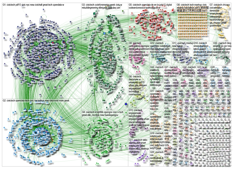
http://nodexlgraphgallery.org/Pages/Graph.aspx?graphID=50133
Downloaded 14 October 2015.
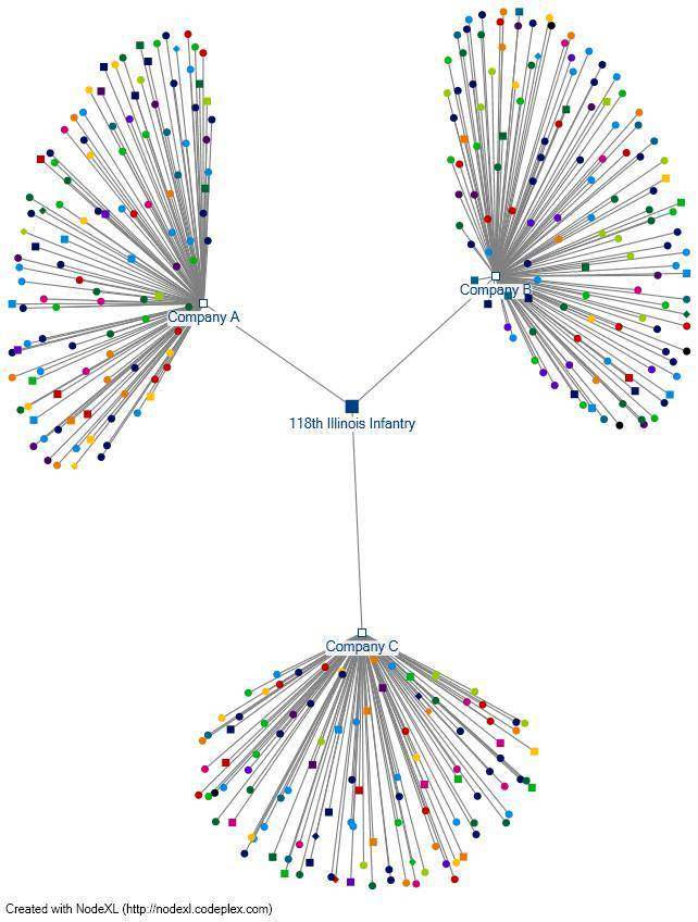
Here’s a graph I created using a portion of the data from the 118th. It represents the members of three companies of the 118th, grouped by age (represented by color) and officer/enlisted status (squares and circles, respectively.)
The experimented ended there, because the next step is to figure out a way to float these networks over a map in order to represent geographic locations. And that, dear classmates, is part of the reason I am in this class.

[…] discussion of developing a semantic web is rather technically thick to the lay reader — Wikipedia’s page on the topic illustrates it a bit […]